

When life falls into a bell curve
- Joanna Makowska

- Apr 17, 2025
- 5 min read
Have you ever had a teacher go over the test results after a particularly tough exam and list how many students received each grade? Imagine a class of 14 students: five received a 4 (good), three got a 3 (satisfactory), two earned a 5 (very good), another two got a 6 (excellent), and one student each received a 2 (poor) and a 1 (failing). If you plot this as a bar chart, with each square representing one student, you’ll notice that the shape forms a little hill – with the highest bar in the middle and shorter ones on the sides. A similar pattern shows up in many areas of life. For example, IQ test results tend to cluster around 100. When it comes to height, most men are around 180 cm tall, and most women are around 165 cm. Does that mean most of us are just... average? Don’t worry. Even if that’s true, as Michael Scott from The Office once wisely said:
“[God] made too many normal people. Because you know what? That's what He likes. That's His favorite. He’s got a thing for the normals” (Season 5, Episode 11, “Moroccan Christmas”).
All of these values follow a consistent pattern that mathematicians call the normal distribution. It’s one of the most important concepts in statistics, helping us understand why most people and outcomes tend to fall near the average, while extremes are much rarer.
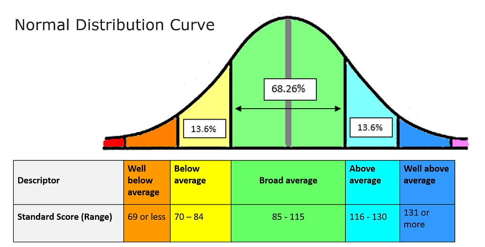
This curve represents the distribution of IQ scores in the general population:
There’s a story that the famous French mathematician Henri Poincaré once suspected his local baker of cheating him by selling underweight bread. Instead of complaining, he did what any true mathematician would do: he bought a loaf of bread every day for a year and weighed it at home. According to the baker, each loaf was supposed to weigh exactly 1 kilogram. Poincaré knew that if the weight was slightly off once or twice, it didn’t prove anything as random variations happen. But after collecting a full year of data, he plotted the results and noticed something interesting: they formed a perfect bell curve, just like the normal distribution. The problem? The peak of the curve was around 0.95 kg, not the promised 1 kg. The weight of the loaves was a random variable, affected by things like flour quantity, baking time, humidity — all small factors that vary slightly each day. But if the average is consistently low, something isn’t right. So, as the story goes, Poincaré went to the police with his data, and the baker was fined. Still not satisfied, the mathematician continued weighing loaves for another year. When he added the second year of data to his chart, he saw something new: the curve had shifted to the right and no longer followed the perfect bell shape. His conclusion? The baker had realized he was being watched and had started selling him the heaviest loaves, which distorted the natural distribution.
How statistics changed science
Adolphe Quetelet was fascinated by data and the hidden patterns within numbers. He was one of the first people to analyze social phenomena using scientific and mathematical tools. He became interested in crime statistics and noticed something surprising: the number of crimes in a given region remained fairly constant from year to year, and even the proportions of weapons used in crimes stayed nearly the same. This discovery led him to explore human behavior more broadly. He began to view people not as isolated individuals but as part of a larger population. He collected data on clothing and shoe sizes sold in shops, and analyzed people’s height, weight, and other physical characteristics. It turned out that these numbers formed a familiar pattern, a bell-shaped curve, just like the one seen in many natural phenomena. Quetelet was the first to show that mathematical order can emerge from the apparent chaos of human behavior and that order often takes the shape of the normal distribution.
In the 19th century, physicists started asking a new question:How can the motion of billions of invisible gas particles produce something as stable and predictable as temperature or pressure? After all, each particle moves randomly and independently. It’s impossible to track them all but there was another way: statistics. That’s exactly what James Clerk Maxwell and later Ludwig Boltzmann did. Instead of trying to describe every particle individually, they treated a gas as a large population of atoms, much like Quetelet treated a society. Their key insight was simple: Even though a single atom behaves randomly, the entire population of atoms behaves predictably and can be described using statistical distributions. Maxwell was the first to calculate the probability that a gas molecule has a certain speed. He discovered that most molecules move at an average speed, while only a few are very slow or very fast just like in a normal distribution. Boltzmann later expanded on these ideas and laid the foundation for statistical physics, which connects the laws of mechanics with the probability theory.
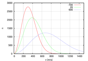
This graph illustrates the Maxwell–Boltzmann distribution of molecular speeds in a gas at three different temperatures. The x-axis shows the speed of particles and the y-axis shows the number of particles with that speed. As the temperature increases, the curve flattens and shifts to the right, meaning that more particles move faster on average.
Definitions
The bell curve is a graphical representation of the normal distribution — a common pattern in statistics where most values cluster around the average, and fewer values appear as you move away from the center. The curve has a characteristic bell shape: it rises to a peak in the middle and falls symmetrically on both sides.
The bell curve refers to the graph of the normal distribution's probability density function, given by:

The Central Limit Theorem says that if we take many random samples from any population and calculate their averages, those averages will form a bell-shaped curve. This happens even if the original data is not normally distributed. The more samples we take, the closer the shape gets to a perfect normal distribution. That’s why the normal curve appears so often in statistics and in real life.
Bibliography
Bellos, Alex. Alex w krainie liczb. Translated by Tomasz Lanczewski, Wydawnictwo Literackie, 2014.
“Central Limit Theorem.” Khan Academy, www.khanacademy.org/math/statistics-probability/modeling-distributions-of-data. Accessed 6 Apr. 2025.
“Central Limit Theorem – Explained Simply.” StatQuest with Josh Starmer, YouTube, uploaded by StatQuest, 3 May 2018, www.youtube.com/watch?v=zeJD6dqJ5lo. Accessed 6 Apr. 2025.
“Maxwell–Boltzmann Distribution.” Wikipedia, Wikimedia Foundation, https://en.wikipedia.org/wiki/Maxwell–Boltzmann_distribution. Accessed 6 Apr. 2025.
“Normal Distribution.” Wikipedia, Wikimedia Foundation, https://en.wikipedia.org/wiki/Normal_distribution. Accessed 6 Apr. 2025.

Comments